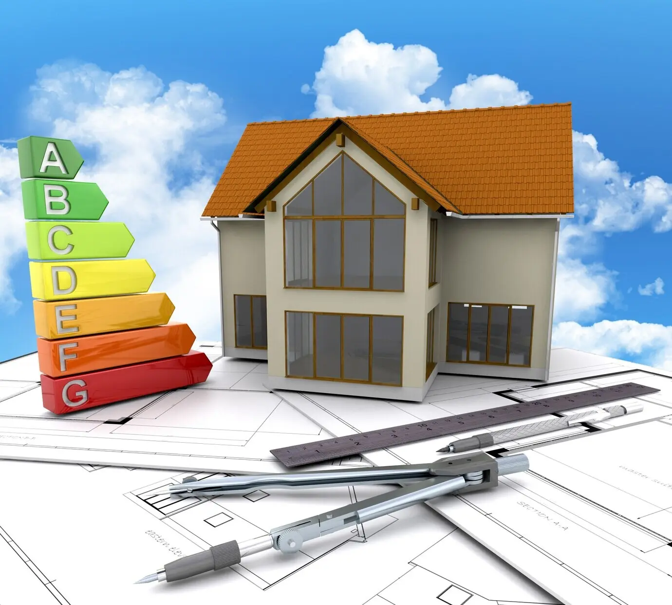
See Your Payback, Clearly Visualized
The ROI Equation, Unpacked Visually
Context: Building Class, HOA, and Location
Kitchen: Layout, Surfaces, and Appliances
Bathroom: Waterproofing and Wellness Details
Lighting, Flooring, and Smart Controls

Scope, Allowances, and Hidden Conditions
We visualize scope as nested boxes, so you can catch where change orders hide: moving plumbing stacks, upgrading risers, or leveling subfloors. Callouts warn about elevator bookings, protection fees, and quiet hours, aligning expectations with the board and keeping the spreadsheet honest from demo through punch list.
Bids, Contracts, and Payment Schedules
Side‑by‑side charts compare bids beyond headline totals, breaking out allowances, exclusions, and labor assumptions. A contract timeline shows deposits, milestones, lien waivers, and retainage, protecting cash while preserving goodwill. That structure steadies ROI, discourages scope creep, and creates accountability when something inevitably runs late or arrives different than specified.
Permits, Insurance, and Board Approvals
Flowcharts decode what your jurisdiction and HOA require, from asbestos surveys to waterproofing affidavits and noise underlay certificates. We list insurance proofs vendors must carry and timing for submissions, preventing shutdowns. Organized paperwork accelerates timelines, safeguards neighbors, and earns goodwill that translates into smoother inspections and safer, stronger valuations.
Visual Tools for Smarter Decisions
Before-and-After ROI Panels
We layer photos, plans, and numbers in synchronized panels. The left shows baseline condition and carrying costs; the right shows upgraded finishes, rent or price expectations, and net proceeds. A subtle delta bar isolates value created by design choices rather than market drift, clarifying true performance you can defend.
Comparative Upgrade Matrix
A matrix maps each upgrade across cost, disruption, and return, helping you sequence work around life constraints. Color-coded quadrants spotlight quick wins like lighting, paint, and hardware, while cautioning against scope monsters that stretch permits and patience, ensuring your schedule and capital stay aligned with realistic, satisfying outcomes.

Stories Behind the Numbers
The Galley That Became a Buyer Magnet
A forty-year-old galley kitchen kept scaring buyers until a modest reconfiguration opened sightlines and added closed storage. Costs stayed lean, thanks to stock cabinetry and precise electrical planning. The infographic postmortem showed eighteen percent resale lift, two-week market time, and zero board complaints because noise and debris rules were respected.
Waterproofing Saved the Day
A small bathroom redo nearly stalled when a hidden slope issue appeared. The team paused, installed proper membranes, and documented details for the board. Our visualization recapped added costs against avoided damage risk, persuading the insurer and buyer that careful work preserved value, safety, and long-term peace of mind.
Light, Floors, and a Faster Lease
A landlord swapped buzzing fixtures for warm, dimmable LEDs, layered task lighting, and replaced hollow floors with quiet underlays. The unit leased in three days at a premium. The infographic showed lower utility costs, fewer complaints, and stronger retention, translating conveniences into measurable returns the owner could trust.
From Plan to Payback

Staging and Photography That Prove Value
Staging plans target views, storage, and lighting improvements; photography captures materials accurately to avoid appraisal skepticism. Checklists coordinate cleaning, punch, and daylight. By connecting your visuals to the final listing, you reinforce the story that buyers and lenders reward, accelerating offers and making the return both visible and verifiable.
Appraisal and Buyer Feedback Loops
Staging plans target views, storage, and lighting improvements; photography captures materials accurately to avoid appraisal skepticism. Checklists coordinate cleaning, punch, and daylight. By connecting your visuals to the final listing, you reinforce the story that buyers and lenders reward, accelerating offers and making the return both visible and verifiable.
Invite, Subscribe, and Share Your Visuals
Staging plans target views, storage, and lighting improvements; photography captures materials accurately to avoid appraisal skepticism. Checklists coordinate cleaning, punch, and daylight. By connecting your visuals to the final listing, you reinforce the story that buyers and lenders reward, accelerating offers and making the return both visible and verifiable.